What is a block?
A block is a chunk of responsive HTML that comes from a library. Each block exposes a set of parameters — editable fields like headline text, images, button labels, colors, and links. When you change a parameter, the block’s preview updates immediately.Adding blocks
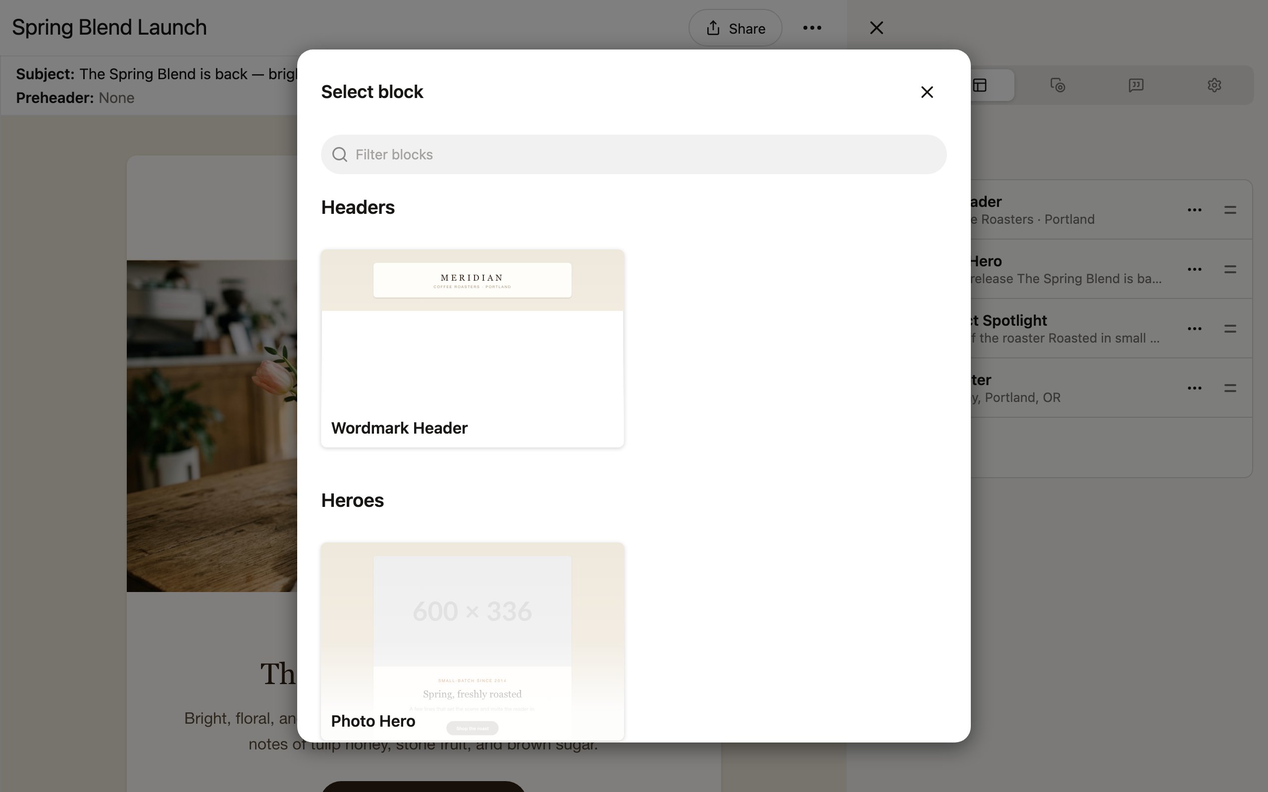
To add a block to your project:- Click New block in the Edit tab, or click Add first block… in the preview area (for a blank project).
- A block picker dialog opens, showing visual previews of all available blocks from your project’s library, organized by category (Headers, Content, Footers, etc.). The dialog is titled Select block when opened from the Edit tab, and Insert block when you add a first block or insert relative to an existing block in the preview.
- Browse the categories to find the block you need.
- Click a block to insert it into your project.
Reordering blocks
Rearrange blocks by dragging and dropping: The Edit tab shows all your blocks in a list with drag handles (≡) on the right side of each one. To reorder:- Click and hold the drag handle next to the block you want to move.
- Drag it to the new position in the list.
- Release to drop it into place.
Configuring block parameters
Select a block in the editor to open its parameters in the Edit tab of the right sidebar. What you see here is controlled by your library’s admin or developer. They decide exactly which fields are editable and which are locked — this is how Denada preserves brand guardrails. Anything can be made editable (colors, fonts, images, layout options), but only the parameters the library exposes will appear here. Design elements that should stay consistent across your team’s emails — like font choices, spacing, and brand colors — remain locked down so they can’t be accidentally changed. Common parameter types include:
To edit a parameter, click into its field in the sidebar and make your changes. The block preview updates in real time.
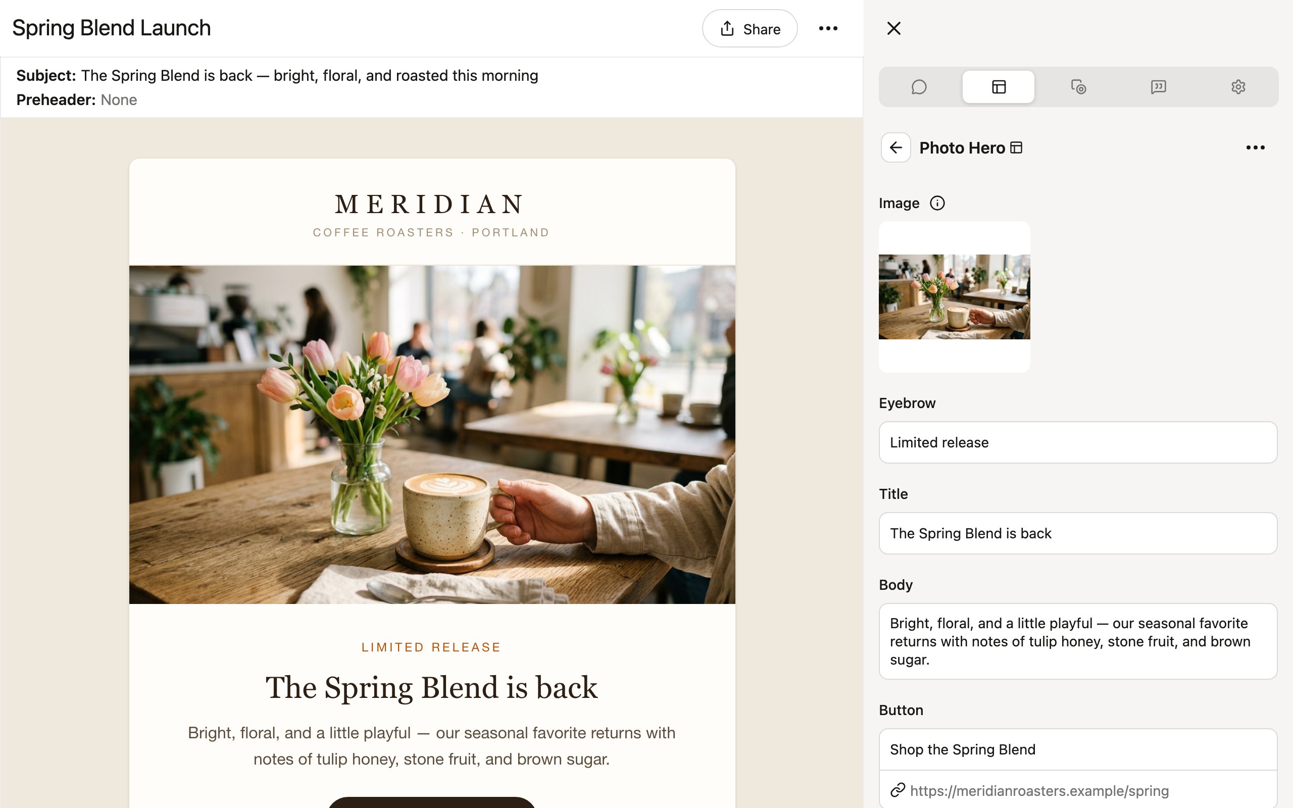
Editing text
Click a text parameter to type directly. Some text fields support basic formatting like bold and italic, depending on how the library was designed.Working with images
Click directly on an image in the preview to access the full image menu — crop, change format, replace, auto-generate, remix with AI, and more. Learn more about using images in projects →Adding links
When a parameter supports a link (on buttons, images, or text), click Add link to open the Edit link dialog. Enter a destination URL and choose the link type:- Static — a regular URL. Denada adds
https://by default. - Dynamic — for ESP merge tags or dynamic URLs (e.g., Iterable Handlebars tags).
https://is not added, so you can enter the tag syntax directly.
Setting colors
Click a color parameter to open the color picker. You can enter a hex code, use the picker, or select from your brand’s preset colors if available.Advanced text editing
Some text parameters support style tags — a formatting system created by your library author that gives you precise control over typography within a block. You’ll know a field supports style tags when you see an Update button next to it (style tag changes are not real-time — you need to click Update to see them). Style tags let you format text by wrapping it in tag brackets:- Color tags — apply brand colors:
[orange]BUILT FOR THE GRIND[/] - Font family — switch typefaces:
[futura]Headline text[/] - Font weight — control boldness:
[900]Heavy headline[/] - Font size / line height — precise sizing:
[48/50]Large text[/] - Effects — shadows, glows, outlines:
[shadow]Text over image[/] - Letter spacing — tighten or loosen:
[tight]COMPRESSED HEADLINE[/]
Advanced text editing is not widely used — library authors typically only deploy it on parameters where fine typographic control is needed, like hero headlines. Always close tags with
[/] and check your library’s documentation for the available tags.Block actions menu
Click the ⋯ button on a block to open the block actions menu. You can find this button in two places — on the block in the preview area, or at the top of the block’s parameter panel in the Edit tab. From here you can:- Change block — swap this block for a different one from your library, keeping its position in the project. Your parameter values are not deleted, but may not match up with the new block.
- Delete block — remove the block and all its parameter values.
- Insert block before / after — add a new block directly above or below this one.
- Duplicate up / down — create a copy of the block (with all its current parameter values) above or below the original.
- Add variant — create an alternate version of this block that renders for certain recipients at send time.
- Conditional rendering — set a condition that controls whether this block renders at all.
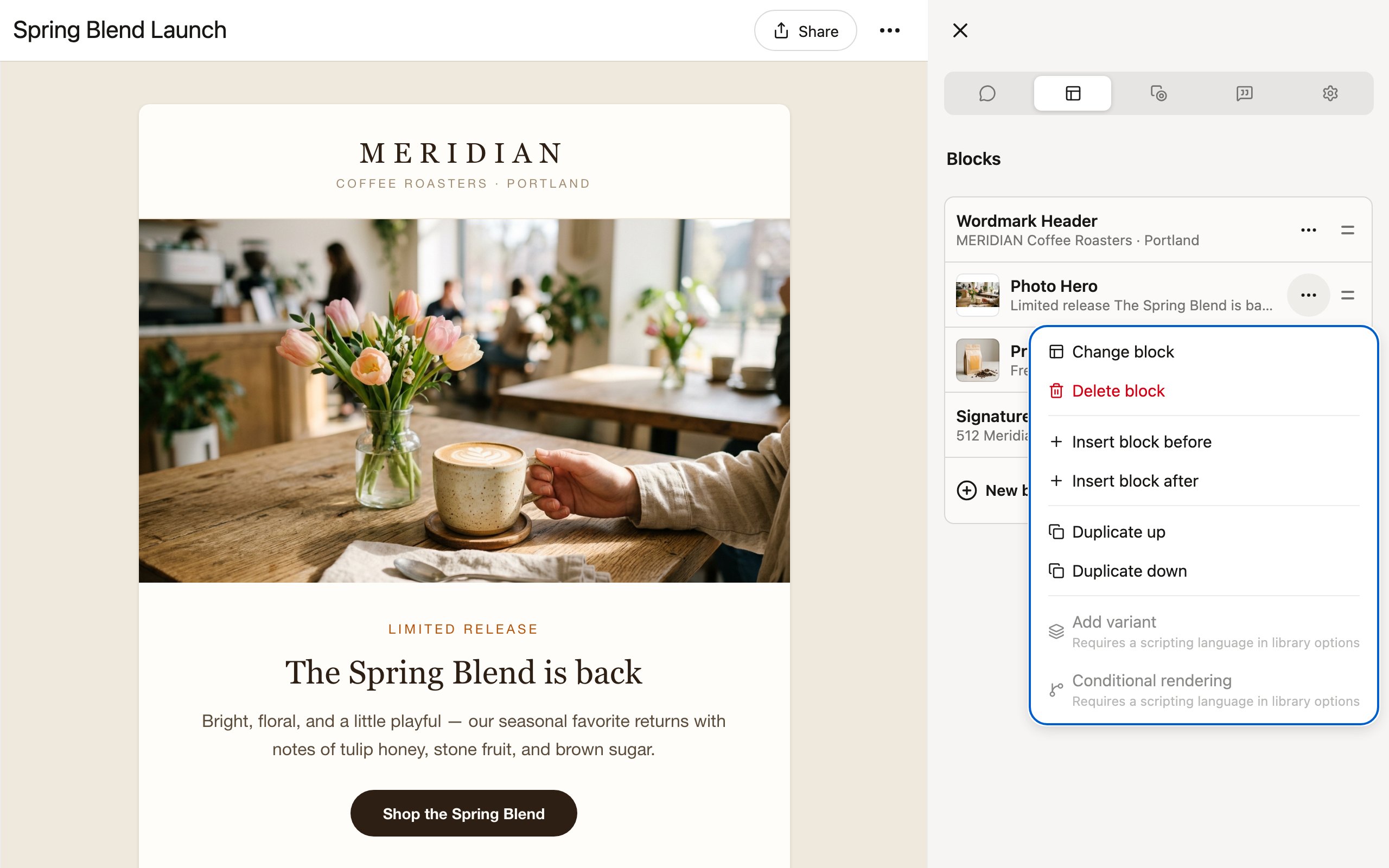
Add variant and Conditional rendering require your library to have a scripting language (like Liquid) configured, since the exported HTML needs to include your ESP’s control structures. See Personalization & dynamic content for how these work.
Tips
- Start with the structure. Add all the blocks you need first, then fill in the details.
- Use duplicate for repetition. Duplicating a block is faster than adding a new one and re-entering shared values.
- Preview often. Toggle between desktop and mobile views to make sure your blocks look good at every size.
Blocks inherit their design from the library. If you need to change the underlying structure or styling of a block (not just its parameters), you will need to edit the library itself. See Using libraries.